

Packaging colors usually miss your brand color for four reasons: the artwork was printed in CMYK instead of a Pantone spot color, the paper stock changed the color, the lamination shifted it, or nobody agreed a color standard before printing. To get an accurate match, give Pantone codes (not screen colors), specify the paper and lamination, and approve a printed proof on the actual production material before mass printing.
This guide is written by PackPro (packpropkg.com), a factory-direct packaging manufacturer in Dongguan, China, producing rigid, magnetic and collapsible boxes for beauty, luxury and e-commerce brands since 2006.
Signs you have a color-matching problem
- Your box looks different from your website or brand guidelines
- Your brand color looks dull, muddy or “off” on the box
- Black looks grey or slightly brown
- The color changed after lamination was added
- Different box components (lid, base, insert) don’t quite match
Why packaging colors go wrong
1. CMYK vs Pantone
CMYK builds color from four inks, and some brand colors (bright oranges, vivid blues, pastels, metallics) can’t be reproduced accurately in CMYK. A Pantone spot color uses pre-mixed ink and hits the exact shade. If your brand color is critical, print it as a spot color.
2. Screen colors aren’t print colors
RGB and hex codes are screen colors. A factory can’t print “#FF6B35”. It needs a Pantone code (e.g. Pantone 1585 C) or a physical color reference.
3. Paper changes the color
The same ink looks different on white art paper, kraft, and textured specialty paper. Kraft absorbs ink and darkens it. Uncoated paper makes colors softer.
4. Lamination shifts the shade
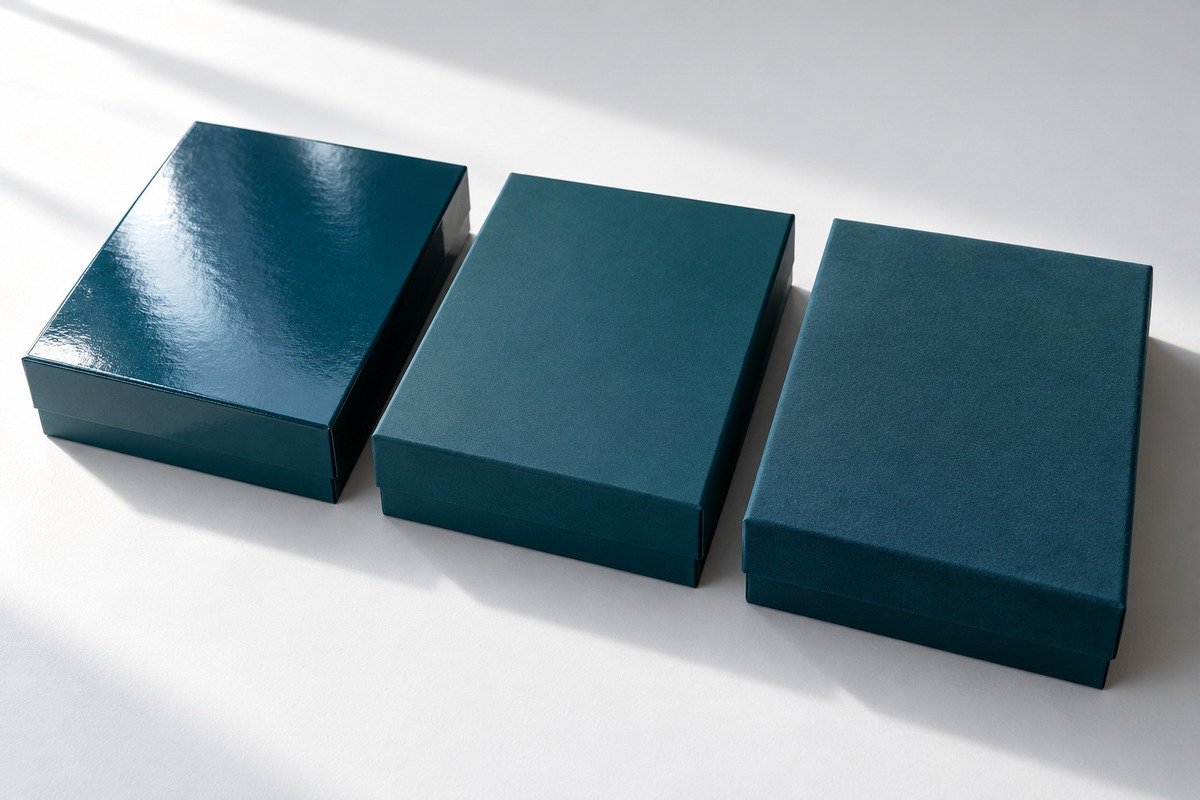
| Finish | Effect on color |
|---|---|
| Gloss lamination | Colors look richer and more saturated |
| Matte lamination | Colors look slightly lighter and softer |
| Soft-touch lamination | Noticeable muting; darks can look greyish |
| No lamination | Truest to ink, but less protection |
This is why the proof must be made with the final lamination. Approving an unlaminated proof is one of the most common mistakes.
5. Rich black isn’t specified
Plain 100% K black often prints greyish. Ask for a rich black build or a black Pantone for large black areas, especially on luxury boxes.
Step-by-step: how to get an accurate brand color
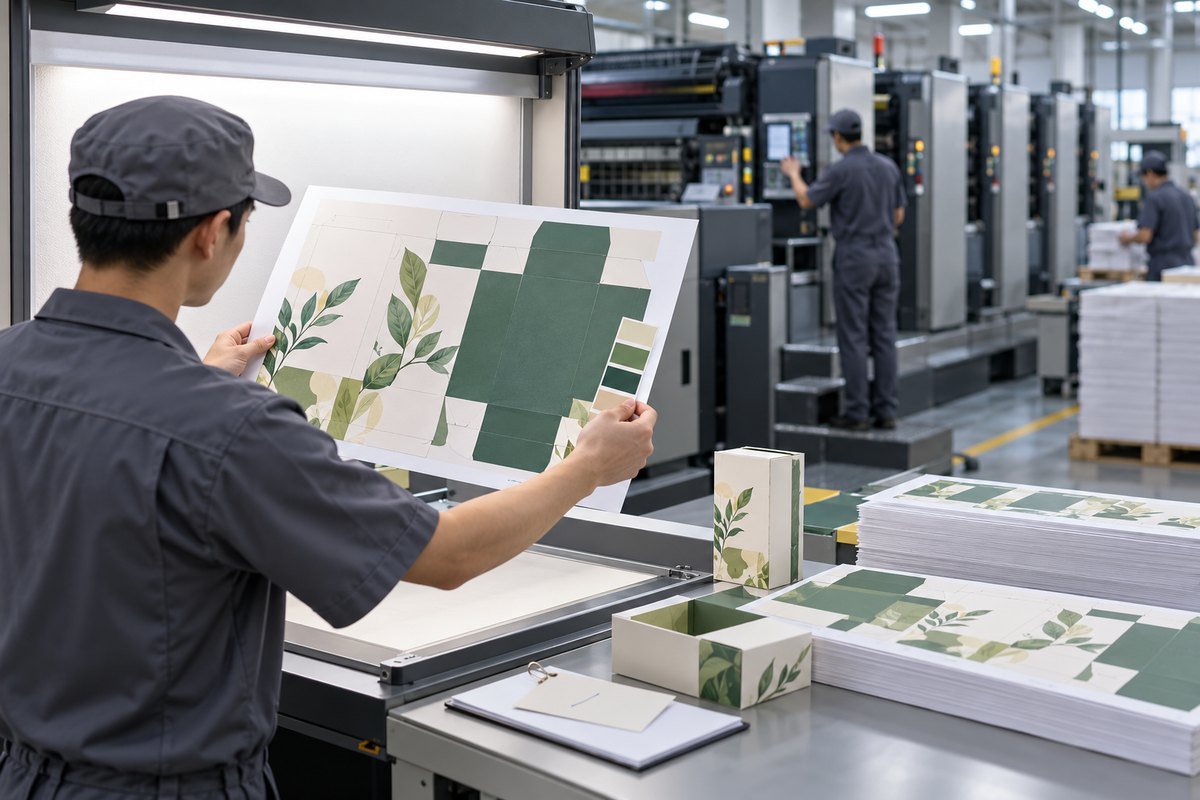
- Give Pantone codes for every brand color (C for coated paper, U for uncoated). Check them against an official Pantone guide, not a screen.
- Specify the paper (e.g. 157 gsm art paper, kraft, or specialty texture).
- Specify the lamination: gloss, matte, soft-touch or none.
- Send a physical color reference if you have one: a previous box, a Pantone swatch, or a brand item.
- Approve a printed proof on the production paper with the final lamination.
- Agree a tolerance. Many brands use Delta E ≤ 2–3 for key brand colors.
- Keep the approved proof as the color standard for every reorder. See keeping batches consistent.
Quick reference: which method for which color?
| Brand color type | Best method |
|---|---|
| One or two critical brand colors | Pantone spot color |
| Photos, gradients, full-color artwork | CMYK, with spot colors added for brand elements |
| Gold, silver, metallics | Hot foil stamping (not printed metallic ink) |
| Solid colored box with no artwork | Pre-colored specialty paper |
| Large black areas | Rich black or black Pantone |
How PackPro handles color matching
- Pantone spot-color printing for brand-critical colors
- Printed proofs on your actual paper and lamination
- Color checked against the approved proof before mass printing
- Approved proof kept on file for every reorder
- Foil stamping, embossing and spot UV in-house
- FSC-certified paper options
Beauty and luxury brands, where color is everything, can see our beauty and luxury packaging approach.
Need your box to match your brand?
Send your Pantone codes (or a photo of your current box next to your brand color) and we’ll recommend the right print method, paper and finish.
FAQ
Why does my packaging color look different from my design?
Screens show RGB color while packaging is printed in CMYK or Pantone inks, and paper and lamination also shift the shade. Use Pantone codes and approve a proof on the final material.
Should I use Pantone or CMYK for packaging?
Use Pantone spot colors for brand-critical colors and CMYK for photos and full-color artwork. Many boxes combine both.
Does matte lamination change packaging color?
Yes. Matte lamination makes colors look slightly lighter and softer, and soft-touch lamination mutes them more. Always proof with the final lamination.
How do I get gold color on packaging?
Use hot foil stamping for real metallic gold. Printed gold ink looks flat and brownish compared with foil.