
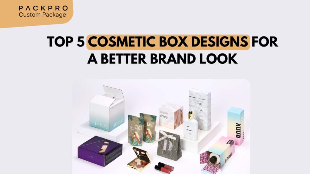
In the beauty and cosmetics industry, the packaging is the product’s first ambassador. Before a customer reads the ingredient list, before they smell the fragrance, before they test the texture — they see the box. And in an industry where dozens of products compete on identical shelf space or scroll feed, the design of that box can be the entire difference between a purchase and a pass. These five cosmetic box design approaches are defining what premium beauty packaging looks like today.
Why Cosmetic Packaging Design Matters So Much
The cosmetics and beauty market is one of the most intensely competitive in retail. Consumers make purchasing decisions in seconds. The box design communicates brand personality, product quality, target demographic, price point, and brand values — all in a single visual impression. Research consistently shows that cosmetics packaging is one of the top purchase drivers in the beauty category, particularly for first-time buyers.
Design #1: Clean Minimalism with Premium Material
The most enduring design trend in prestige cosmetics is restrained minimalism: clean white or neutral packaging, simple serif or sans-serif typography, and one or two carefully chosen premium finishes (often a foil brand name or embossed logo). The message is confidence — a brand that needs no visual noise to communicate its quality.
- Base: White, ivory, or light grey paperboard or rigid box
- Typography: Clean serif or minimal sans-serif; generous white space
- Finishes: Gold foil brand name, soft-touch lamination, blind deboss logo
- Best for: Skincare serums, anti-aging products, high-end moisturizers, prestige perfume
Design #2: Bold Color Brand Identity
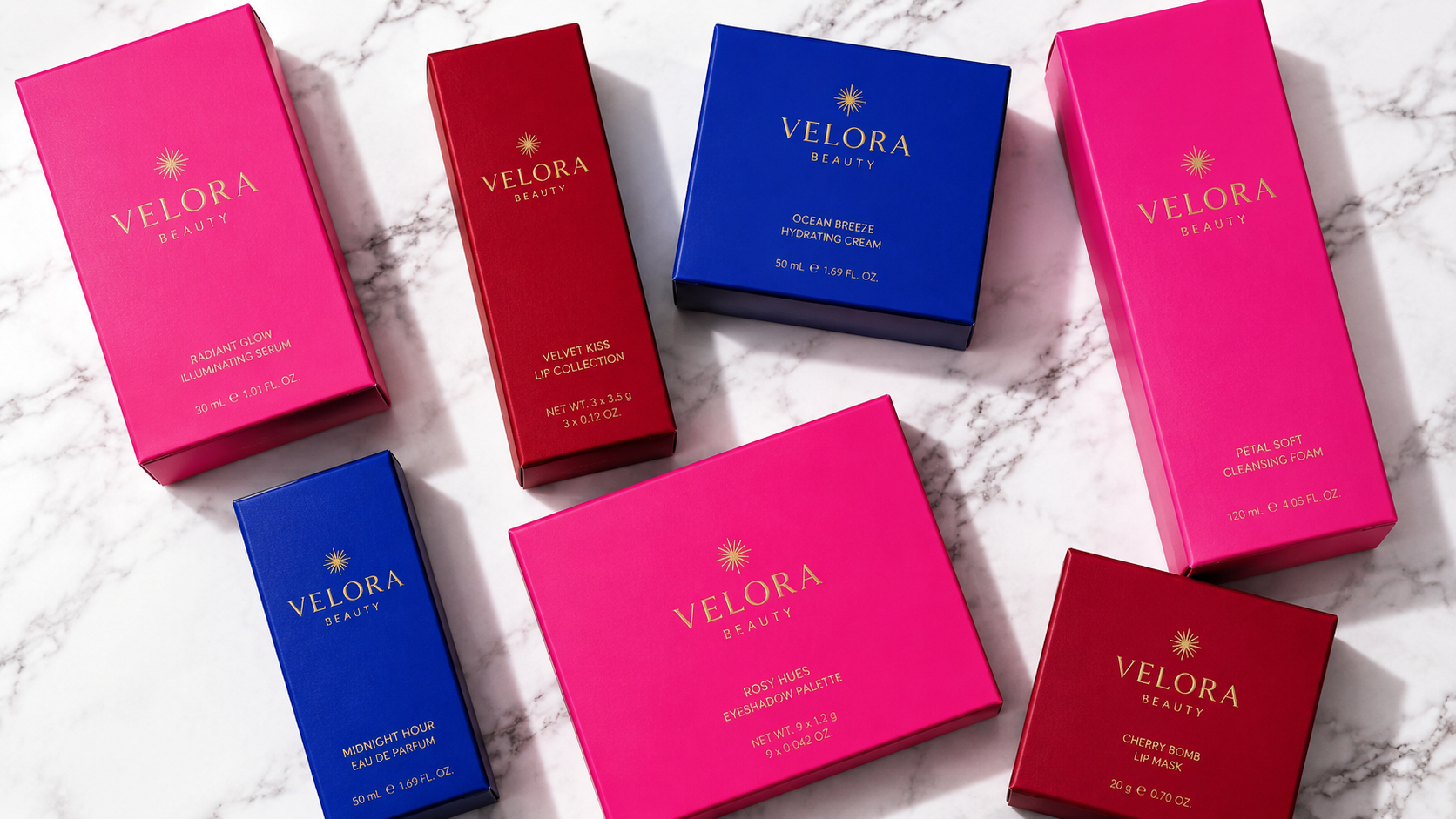
Color is one of the most powerful brand differentiation tools available to cosmetic brands. Using a distinctive, ownable color as the dominant packaging design element makes the product instantly recognizable from across a shelf or a phone screen.
- Approach: Choose one dominant brand color and build the entire packaging around it
- Support: Minimal secondary color, white or black text, simple logo
- Finishes: Matte finish on bold colors for depth; gloss for vibrant, pop-art aesthetics
- Best for: Color cosmetics (lipstick, eyeshadow, blush), nail care, energetic lifestyle beauty brands
Design #3: Illustrated or Artisan Aesthetic
Hand-drawn illustrations, botanical patterns, and artisan-style artwork on cosmetic packaging signal that the brand cares — about craft, about nature, about provenance. This design direction is particularly powerful for natural, organic, and clean beauty brands.
- Illustration style: Botanical line drawings, watercolor elements, hand-lettered type, heritage print patterns
- Color palette: Natural tones — sage green, terracotta, warm neutrals, dusty rose
- Finishes: Uncoated or soft-touch lamination to preserve the tactile artisan quality
- Best for: Natural skincare, organic makeup, aromatherapy, indie beauty brands

Design #4: Luxury Rigid Box with Mirror or Satin Interior
For prestige cosmetics collections, gift sets, and limited editions, the rigid box with a satin or mirror-finish interior is the benchmark for premium. The unboxing ritual — lifting a precisely fitted lid, seeing products nestled in satin or against a mirror-lined interior — creates a sensory experience that customers associate with high-end retail.
- Construction: Rigid greyboard wrapped in specialty paper or fabric
- Exterior: Matte or gloss wrap with foil stamping, embossing, or screen printing
- Interior: Satin or velvet lining, custom foam or cardboard tray, mirror panel on lid
- Best for: Cosmetics gift sets, makeup palettes, premium fragrance, holiday collections
Design #5: Transparent Window Box Showcasing the Product
For cosmetics where the product itself is visually appealing, a window box that reveals the product through a clear PET or acetate panel is a highly effective design choice. The product’s color, texture, and form do the selling work; the packaging frames and protects.
- Window shape: Full front panel, circular, arch, or custom die-cut shape
- Construction: Folding carton (mid-range) or rigid box (premium) with clear PET insert
- Design support: Clean, minimal packaging design lets the product be the hero
- Best for: Makeup palettes, bath products, colorful skincare, novelty or gift beauty items
Comparing the 5 Cosmetic Box Designs
| Design | Brand Positioning | Price Point | Key Differentiator |
|---|---|---|---|
| Clean minimalism | Prestige, clinical, pure | High | Restraint communicates confidence |
| Bold color identity | Energetic, modern, playful | Mid to High | Instant shelf recognition |
| Illustrated artisan | Natural, craft, authentic | Mid | Story-driven, handcrafted feel |
| Luxury rigid box | Premium, gifting, occasion | High | Unboxing experience, reusability |
| Window showcase | Any — product-led | Mid | Product visibility drives purchase |
Key Considerations for Cosmetic Packaging Design
- Regulatory requirements: Cosmetics packaging must display ingredients, net weight, country of origin, and other required information
- Sustainable materials: Beauty consumers increasingly favor brands with eco-credentials — FSC-certified board, soy inks, and recyclable construction are increasingly expected
- Photography performance: Your packaging will be photographed constantly — for e-commerce, social media, influencer content
- Consistent range design: Individual products should look like they belong to the same family

Design Your Cosmetic Packaging with PackPro
PackPro works with beauty and cosmetics brands to create packaging that looks as good as the products inside. From minimalist folding cartons with foil accents to full luxury rigid box gift sets, the team delivers packaging that strengthens your brand and drives purchase decisions. Contact PackPro today to explore cosmetic box options for your brand.
Related Reading
- How Packaging Colors Influence Customer Decisions
- Why Custom Rigid Boxes Are Used in Luxury Packaging
- 5 Perfume Box Designs That Instantly Feel Luxury
Frequently Asked Questions
Which cosmetic box design works best for luxury skincare brands?
Clean minimalism with premium finishes — such as soft-touch lamination, a gold foil brand name, and a blind embossed logo on white or ivory board — is the most effective design direction for luxury skincare. This approach communicates purity, clinical precision, and confidence, which directly aligns with what high-end skincare consumers want to believe about the product inside.
How important is cosmetic packaging design for driving first-time purchases?
Packaging design is one of the top purchase drivers in the beauty category for first-time buyers, who have no prior brand experience to rely on. A well-designed box communicates brand personality, quality, and price point in a single visual impression.
What finish options make cosmetic packaging look more expensive?
The most effective premium finishes for cosmetic packaging include soft-touch lamination, hot foil stamping in gold or silver, blind embossing or debossing of logos, and spot UV varnish to create contrast between matte and gloss surfaces.
Can cosmetic packaging be both sustainable and premium?
Yes — FSC-certified paperboard, soy-based inks, and recyclable rigid box construction can all achieve premium aesthetics without compromising sustainability credentials.
Should all products in a cosmetic range use the same box design?
Yes — consistent range packaging is essential for building brand recognition. Individual products should share the same typography, color palette, finish approach, and structural format, even if they vary in size or color accent.