Retail packaging is far more than a simple container; it is a critical sales tool, a physical representation of your brand, and the first tangible interaction a customer has with your product. The strategies employed by leading brands to design retail packaging are not accidental; they are deliberate, research-backed decisions that influence purchasing behaviour, brand recall, and long-term loyalty.
Quick answer: Effective retail packaging design increases brand value and sales by aligning structure with product positioning, using colour and finish to trigger emotional responses, optimising shelf standout, communicating key information clearly, and building consistency across product lines.
Why Retail Packaging Is a Sales Asset, Not Just a Container
Research consistently shows that a significant portion of purchase decisions are made at the point of sale. Packaging is the last communication touchpoint before a customer commits to a buying decision. Brands that treat packaging as a passive container are leaving a significant commercial opportunity unused.
Effective retail packaging simultaneously attracts attention, communicates value, builds trust, and motivates purchase. Each of these functions requires specific design choices that go beyond aesthetics into strategic communication.
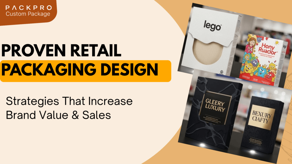
Strategy 1: Lead With Structure Before Graphics
The structural format of packaging establishes the physical presence and perceived weight of a product before any graphics are applied. A rigid box communicates premium quality through its material density and clean angles. A folding carton with a window communicates transparency and product confidence. A pillow box communicates casual gifting.
Choosing the right structure for the right product tier is the foundation of effective retail packaging design. Applying premium graphics to a flimsy structure creates cognitive dissonance that undermines the brand message. Conversely, over-engineering the structure for a value product increases cost without commercial return.
Strategy 2: Use Colour With Intentional Brand Logic
Colour is the first visual element processed by the human brain when scanning a retail environment. Brands that own a distinctive colour position on shelf benefit from immediate recognition that precedes any conscious reading of text or logos.
Effective colour strategy in retail packaging involves selecting hues that align with brand positioning, differentiate from competitors, and communicate the product category conventions that consumers use to navigate shelves quickly. Breaking category colour conventions can be a powerful differentiator but carries the risk of appearing misplaced if not executed with precision.
Finish choice amplifies colour strategy. Matte finishes communicate premium restraint. Gloss finishes communicate energy and visibility. Soft-touch coatings add tactile sophistication. The combination of colour and finish determines the overall sensory impression before a product is touched or read.
Strategy 3: Design for Shelf Position and Blocking
Retail packaging does not exist in isolation; it sits alongside competing products on a shelf, often at a distance of several metres from the consumer. Effective packaging design accounts for how the product will look at distance, in multiples, and in different lighting conditions.
Strong shelf impact comes from clear visual hierarchy, bold use of colour, and graphic elements that are legible and recognisable at arm’s length. Brands that place their most distinctive visual asset, whether a logo, colour, pattern, or product image, prominently and consistently across their product range benefit from shelf blocking effects when multiple facings are displayed together.
Strategy 4: Communicate Value Without Overcrowding
Retail packaging must communicate the essential product story quickly and clearly. Consumers typically make initial product assessments in under three seconds. Copy-heavy packaging that requires sustained reading before the product can be understood loses this moment.
Effective packaging design establishes a clear hierarchy of information: product name, primary benefit or category, variant or flavour identifier, and then supporting details. Regulatory or ingredient information required by law is important but should not visually compete with the primary communication hierarchy.
White space is a strategic tool, not a design failure. Packaging that breathes communicates confidence in the brand. Over-designed packaging that fills every surface suggests insecurity about the product’s ability to speak for itself.
Strategy 5: Build Range Architecture That Travels Together
For brands with multiple products or variants, consistency of packaging architecture across the range is essential. Range architecture means establishing a clear visual system where all products in a family are immediately identifiable as belonging to the same brand while individual variants are clearly distinguishable.
This is typically achieved through a consistent structural format, a fixed logo position and treatment, a consistent typographic system, and a variant differentiation system using colour, imagery, or pattern. When executed well, range architecture creates powerful shelf impact because the collection of products reads as a unified, professional brand rather than a collection of unrelated items.
Strategy 6: Design for the Unboxing as Well as the Shelf
As ecommerce continues to grow as a retail channel, the unboxing experience has become as commercially important as shelf presence. Packaging that creates a memorable moment on opening generates social sharing, positive reviews, and repeat purchase intent.
Interior printing, tissue paper, personalised inserts, and considered product presentation all contribute to the unboxing experience. Brands that invest in these interior details create a competitive advantage that is difficult for competitors to replicate quickly and that generates organic marketing content through customer sharing.