
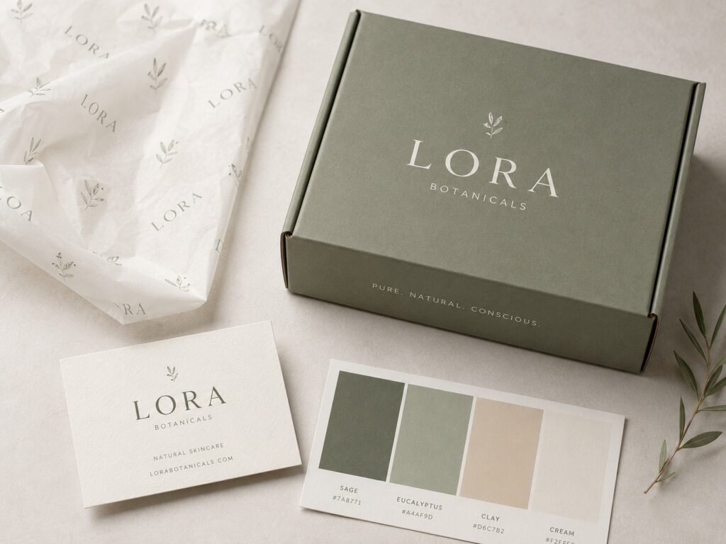
Your packaging is doing a job whether you’ve planned it or not. It’s telling customers what kind of brand you are before they’ve read a single word of your product description. The question isn’t whether your box is sending a message — it’s whether that message is the one you actually want.
Here’s how to build a packaging identity that holds together, even when you’re starting small.
Start with the pieces that carry your brand everywhere
A brand identity isn’t a logo. It’s a set of elements — color, typography, imagery, tone — that work together consistently across your website, your packaging, your social posts, and everything else a customer touches. When those pieces line up, people recognize you faster. When they don’t, your brand feels scattered even if each individual piece looks fine on its own.
For packaging specifically, that means:
- A color palette you use the same way every time, not a different accent shade on every SKU
- Typography that matches your website and your labels, not a font you picked because it looked nice in one design file
- A consistent tone in any printed copy — playful, minimal, technical, whatever fits you — used the same way across every box
Consistency is the part startups skip most often, usually because different pieces get designed at different times by different people. It’s worth going back and checking that your box, your website, and your social presence actually look like they belong to the same company.
Color does more work than you’d think
Color is often the first thing a customer notices about your packaging, before they process anything else — see our breakdown of how packaging colors influence customer decisions for more on this. Using your brand colors consistently — the same shade, the same way, every time — helps people recognize your products faster, especially once they’ve bought from you before. That recognition compounds. A customer who’s seen your green box three times in their feed will spot it on a shelf without reading the label.
This doesn’t mean your packaging has to be loud. It means it has to be consistent. Pick your colors early and don’t drift from them box to box.
You don’t need a $20,000 branding package to start
Branding packages for startups range widely — from a basic identity setup covering just the essentials, up to full brand transformations that run well into five figures. Most early-stage brands don’t need the top of that range. A mid-tier package that covers your logo, color system, typography, and packaging templates is usually enough once you’ve got a product people actually want to buy.
The mistake isn’t spending too little. It’s spending on the wrong things — commissioning an elaborate structural box design before you’ve nailed down your color palette, for example, or paying for five packaging variants when you’ve only validated one product.
Minimalism isn’t a compromise — it’s a trend for good reason
If your budget is tight, that’s not necessarily a disadvantage. Minimalist packaging design — clean layouts, limited color use, simple typography — has become one of the more popular directions in packaging precisely because it looks modern and professional without requiring complex printing or expensive finishes. A clean two-color box with confident typography often reads as more premium than a busy, over-designed one.
Simple doesn’t mean boring. It means restraint — one strong visual idea instead of five competing ones.
The unboxing moment is part of your brand, not an afterthought
Packaging design influences purchase decisions more than most founders expect, and it doesn’t stop at the outside of the box. What’s inside matters too. A well-placed insert, a thank-you card, or a sticker sheet can turn a routine delivery into something a customer photographs and shares. These additions don’t need to be expensive — a printed card costs very little compared to what it does for how the unboxing feels.
If you’re deciding where to put your limited design budget, put some of it here. The outside of the box gets someone to buy. The inside is what makes them remember you. For more on where design pays off, see our roundup of e-commerce packaging designs that increase sales.
Sustainability is becoming part of the brand message itself
A meaningful share of consumers say they’re willing to pay more for packaging that’s better for the environment. That’s shifted sustainable materials from a “nice to have” to something startups are folding into their branding directly — recycled stock, minimal ink coverage, recyclable mono-materials. If it fits your product and budget, it’s worth building into your identity from the start rather than retrofitting later. Our sustainable packaging materials guide breaks down the options.
Putting it together
None of this requires a huge budget or a big agency. It requires picking your core elements — color, type, tone — early, applying them the same way everywhere, and resisting the urge to redesign every time you launch a new SKU. Startups that get this right aren’t the ones who spent the most. They’re the ones who stayed consistent long enough for customers to start recognizing them. Talk to our team if you’re ready to put a packaging identity into production.
Related Reading
- 10 Packaging Branding Mistakes Startups Make (and How to Avoid Them)
- How Packaging Colors Influence Customer Decisions
- Top 5 E-Commerce Packaging Designs That Increase Sales
Frequently Asked Questions
How much should a startup spend on packaging branding?
Branding packages range from around $1,000 for essential identity elements to $80,000+ for a full transformation. Most early-stage brands do fine with a mid-tier package in the $5,000–$20,000 range, covering logo, colors, typography, and packaging templates.
Does minimalist packaging look cheap?
No — minimalist design often reads as more premium than a busy layout, and it typically costs less to produce since it avoids complex printing and finishes.
Should I invest in unboxing extras like inserts or stickers?
Yes, if your budget allows it. Small additions like a thank-you card or sticker sheet are inexpensive relative to their impact on how memorable and shareable the unboxing experience feels.