
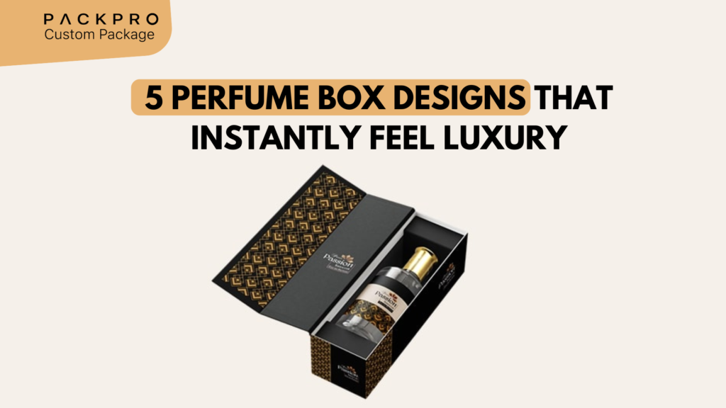
In the fragrance industry, the bottle gets the admiration — but the box creates the desire. Long before a customer lifts the stopper, the packaging has already told them everything they need to know about the scent inside: whether it is delicate or bold, heritage or modern, romantic or austere. The world’s most iconic fragrances invest as heavily in their packaging as in the juice itself, and for good reason. Here are five perfume box designs that achieve that rare quality of feeling luxury the instant you hold them.
Why Perfume Packaging Is a Different Challenge
Perfume packaging faces a unique set of demands that most packaging categories don’t. The product is invisible — you can’t show a photograph of a scent. The bottle is often a primary design asset, meaning the box must complement it without competing. And the price point is frequently high enough that the packaging must justify the cost before the product is experienced. Every design decision communicates something about the fragrance’s character.
Design #1: The Deep-Toned Matte Rigid Box with Gold Foil Typography
Deep, saturated color — midnight navy, forest green, burgundy, obsidian black — combined with restrained gold foil typography is the quintessential luxury fragrance packaging format. The matte surface absorbs light, giving the box a velvet-like quality in photographs and in person. The gold foil catches and reflects light with every movement, creating a dynamic contrast that reads as expensive from any distance.
- Construction: Rigid greyboard wrapped in premium matte paper
- Key technique: Hot gold foil stamping for brand name and decorative elements
- Interior: Matching deep-color satin lining or velvet-effect paper lining
- Why it works: The color and material combination is associated with vault-like luxury — the packaging suggests what’s inside is precious and worth protecting
Design #2: Architectural Minimalism — White, Embossed, Precise
At the opposite end of the spectrum from richly colored packaging sits architectural minimalism: pure white or off-white rigid boxes with a single embossed or debossed brand mark, and nothing else. No color gradients, no pattern, no visual noise. The box communicates confidence — the brand is so certain of its quality that it needs no decoration to make its case.
- Construction: Rigid box wrapped in premium uncoated or soft-touch white paper
- Key technique: Blind emboss or deboss of the logo or brand mark (no ink — the relief is the only decoration)
- Interior: White or cream satin lining; custom-cut foam cradle for the bottle
- Why it works: Purity and restraint in design signal confidence. Niche and artisan fragrance houses favor this approach because it positions the scent — not the packaging — as the hero

Design #3: Heritage Pattern with Lacquered Finish
Heritage fragrance houses — those with decades or centuries of history — often use archival patterns, monograms, or repeat graphic motifs as the primary design element of their packaging. When these patterns are printed on a high-gloss lacquered or UV-varnished surface, the result is a richly textured visual depth that reads as heritage, craftsmanship, and legacy.
- Construction: Rigid box with full-color litho print on high-gloss coated paper
- Key technique: Overall gloss UV varnish or spot lacquer over pattern; foil accent on key brand elements
- Pattern types: Damask, toile, Art Deco geometric, house monogram, archival botanical illustrations
- Why it works: The pattern tells a story of history and craft. The lacquered finish elevates the print to something that feels curated and art-directed rather than simply printed
Design #4: The Drawer Box with Ribbon Pull
The sliding drawer box is one of the most theatrical packaging formats in the fragrance category. The outer sleeve stays in the hand while the inner tray — with a satin ribbon pull tab — slides smoothly out to reveal the bottle nested in its cradle. This reveal sequence is deliberate, slow, and intimate — it mirrors the ceremony of opening a precious gift rather than unwrapping a purchase.
- Construction: Rigid outer sleeve + rigid inner tray with ribbon pull
- Sleeve finish: Matte wrap with foil brand name; often features a contrasting textured or fabric-wrapped interior
- Inner tray: Custom-cut foam or moulded pulp cradle lined with satin or velvet
- Why it works: The physical act of drawing out the tray is a sensory ritual — slow, controlled, and satisfying. It transforms opening the box into a ceremony rather than a task

Design #5: Sculptural Special Edition — Die-Cut, Shaped, and Unexpected
For limited editions, flanker launches, and collector’s releases, some fragrance brands push beyond rectangular formats entirely. Shaped rigid boxes — hexagonal, pyramidal, fan-shaped, or die-cut to mirror the bottle’s silhouette — create a display object as much as packaging. These are the boxes customers keep on their dressing tables long after the fragrance is finished.
- Construction: Custom rigid construction in non-standard shapes; often involves complex structural engineering
- Finishes: Maximum impact — metallic wraps, embossing, foil, specialty textures
- Best for: Limited editions, anniversary releases, collector’s series, ultra-premium flankers
- Why it works: The shape itself is a statement. A box that breaks the rectangular convention signals that this fragrance is different — that it is not competing in the mainstream but defining its own category
The 5 Designs Compared
| Design | Luxury Signal | Best Fragrance Positioning | Key Technique |
|---|---|---|---|
| Deep matte + gold foil | Opulence, depth, drama | Oriental, gourmand, intense | Hot foil on matte wrap |
| White architectural minimalism | Purity, confidence, artisan | Fresh, niche, contemporary | Blind emboss on soft-touch |
| Heritage pattern + lacquer | Legacy, craft, history | Classic, heritage, feminine | Litho print + gloss UV varnish |
| Drawer box with ribbon pull | Ceremony, intimacy, theatre | Premium, gifting, occasion | Rigid sleeve + tray + ribbon |
| Sculptural special edition | Exclusivity, collectibility | Limited edition, prestige | Custom rigid die construction |

What Every Luxury Perfume Box Gets Right
Across all five designs, certain fundamentals are non-negotiable in luxury fragrance packaging:
- Precise fit: The bottle must sit with no movement whatsoever — any rattle or looseness destroys the premium experience
- Weight: The box must feel substantial — too light and it signals cheap construction
- Consistent color: Luxury brands use Pantone or matched inks — color must be identical across every production run
- Clean, sharp corners: Any warping, rounding, or misalignment in the box corners reads as poor quality control
- Smooth closure: Whether friction fit or magnetic, the lid must open and close with a single, smooth, controlled action
Design Your Luxury Perfume Box with PackPro
PackPro produces custom perfume and fragrance packaging for brands that understand the importance of making the right first impression. From deep-toned rigid boxes with gold foil to precision-engineered drawer boxes with satin-lined trays, the team delivers packaging that matches the quality of the fragrance inside. Contact PackPro today to start your luxury perfume box project.
Related Reading
- Why Custom Rigid Boxes Are Used in Luxury Packaging
- Top 5 Cosmetic Box Designs for a Better Brand Look
- Gift Packaging Ideas to Try in 2026
Frequently Asked Questions
What makes perfume packaging feel luxurious?
Luxury perfume packaging relies on a combination of material weight, precise construction, and premium finishes — such as hot foil stamping, soft-touch or matte lamination, satin or velvet interior lining, and a perfectly fitted bottle cradle that eliminates any movement. The box must feel substantial in the hand, open and close smoothly, and have sharp, clean corners — any deviation from these standards signals lower quality.
Which perfume box design is best for gifting?
The drawer box with a ribbon pull is widely considered the most gifting-appropriate perfume packaging format because its slow, deliberate reveal mimics the ceremony of opening a precious gift. The outer sleeve holds while the inner satin-lined tray slides out, creating a theatrical, intimate moment. This format consistently generates social sharing and is favored for occasion fragrances and gift sets.
How should the perfume box relate to the bottle design?
The box should complement the bottle without competing with it — the bottle is the primary design hero, and the box frames and protects it. This means aligning color palette, material vocabulary, and aesthetic direction between bottle and box, while ensuring the box’s interior cradle fits the bottle so precisely that there is zero movement. When box and bottle feel like a unified design, the overall luxury perception increases significantly.
What is the difference between a matte and a lacquered finish for perfume boxes?
A matte finish absorbs light and gives the box a soft, velvety tactile quality that reads as understated luxury — ideal for contemporary, niche, or minimalist fragrances. A lacquered or high-gloss UV finish reflects light, creates richness and depth in printed patterns, and conveys a more opulent, heritage aesthetic. Many premium boxes use both in combination — matte base with spot gloss accents — for maximum visual contrast.
Can a custom perfume box be designed for a limited edition or collector’s release?
Yes — limited edition perfume boxes can be designed in non-standard shapes (hexagonal, pyramidal, or custom die-cut silhouettes), specialty materials (metallic wraps, fabric-covered boards, specialty paper), and unique opening mechanisms that transform the box into a display object. These sculptural formats are designed to be kept and displayed long after the fragrance is used, which significantly increases their perceived value and collectibility.